This task was to construct a typographical logo using your own name in Adobe Illustrator, combined with the creative influences from Session 1. First I began to just write out my name a couple of time in a variety of ways on a sheet of A4.
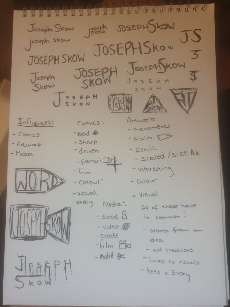
After experimenting with my name, I created 3 lists with keywords based on my influences.
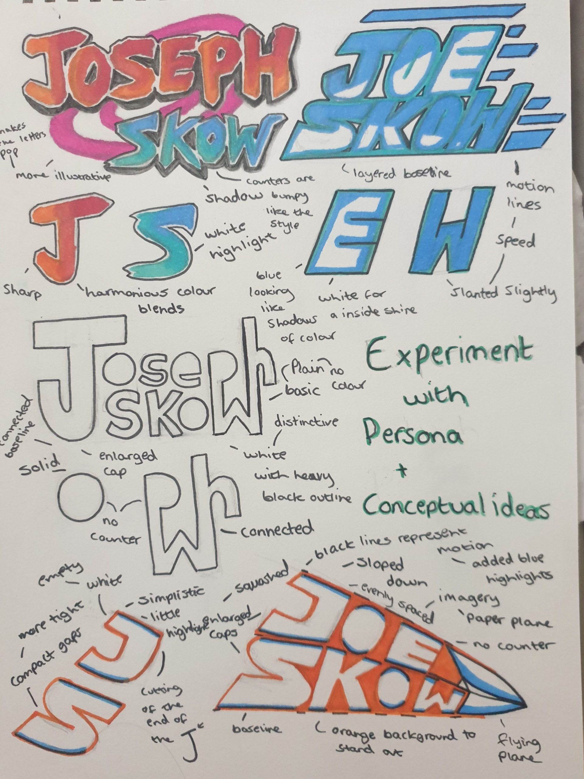
I used this exercise as inspiration, to gain ideas about which type of scaling or font to approach when creating the logo.
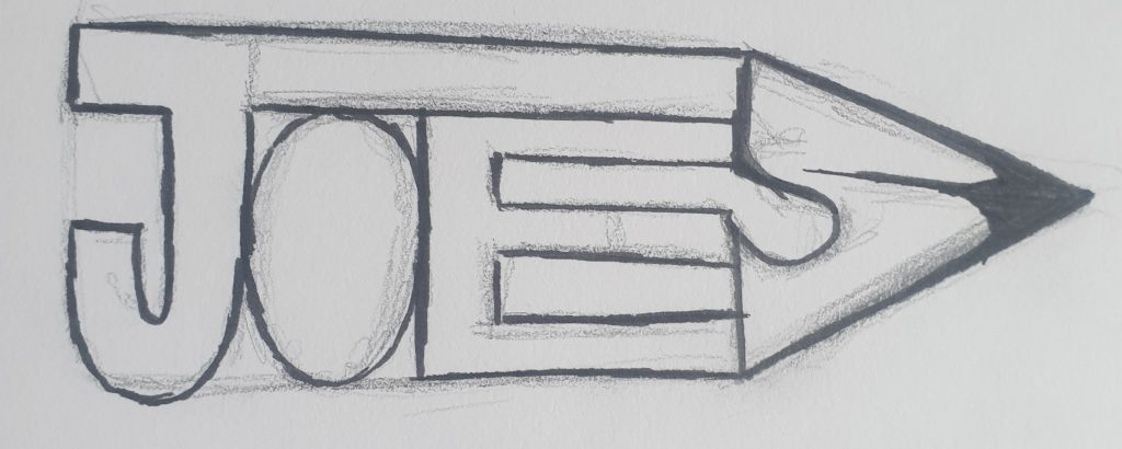
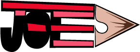
For my logotype idea, I decided to go for an appearance of a pencil. The pencil shape idea came from what all my influences have in common, which I narrowed it down to they all start from a plan or a sketch. Sketches are normally made in pencil like concept art so I thought it would be relevant if I incorporated that idea into my logo.
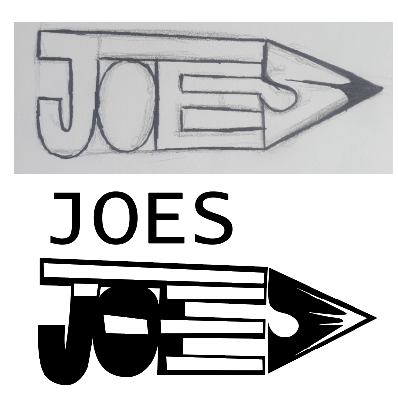
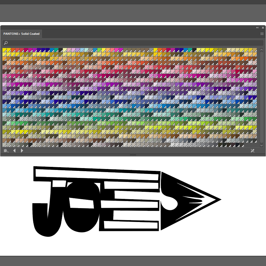
To construct my letter forms I used the pen point tool in Illustrator, this gave me the correct shapes needed. Kerning between the letters are tight, the gap length does differ however between the “e” and “s” because of the way the pencil is structured.
In my opinion the shades of red make it feel like an actual pencil, giving a little section of depth to the imagery. A soft brown was used to create the led point, I did try it with grey or black but I felt that it gave a heavy appearance.
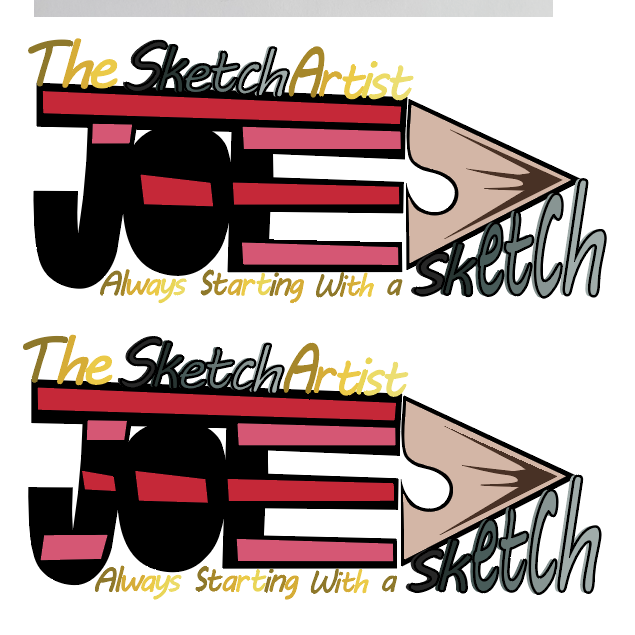
Finally I wanted to experiment with the stripes again to see if it was missing out. I personally prefer the first one as the stripes kind of look like movement lines to the point of the pencil, this could have a meaning of developing or getting something started in the right direction.