
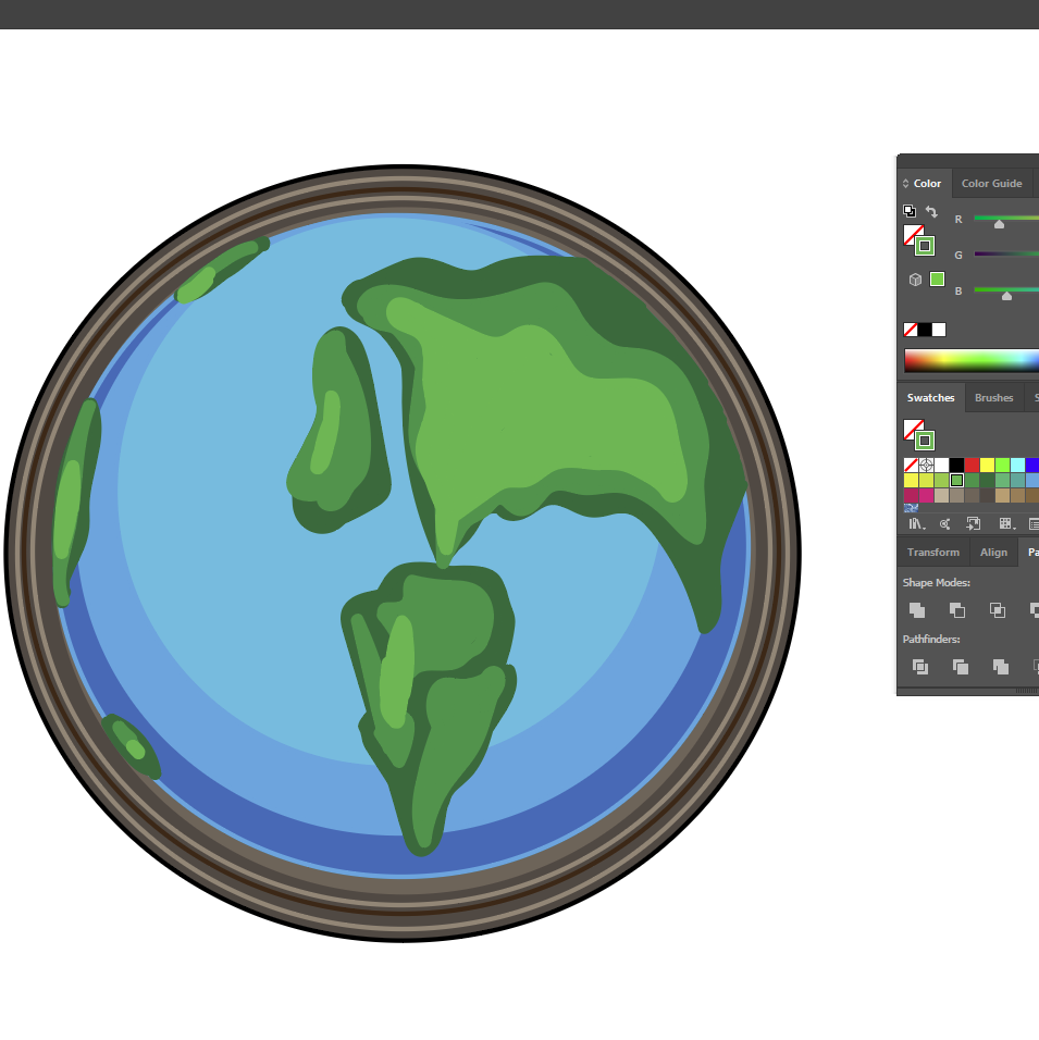
To begin, I started by adding dark brown circle shapes to the image with a variety of hints of light brown each time to create the base frame of the clock. Harmonious blues and greens were then used on top of this to build up the depth and boldness of the world onto the clock.
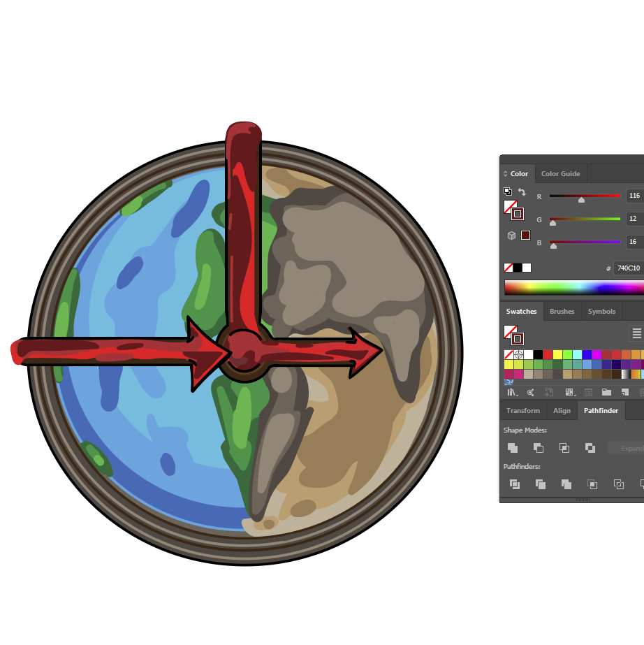
To create the difference between new and old, I altered the appearance of one half of the clock. By changing it to a variety of browns, I was hoping to achieve the appeal of an old world map.
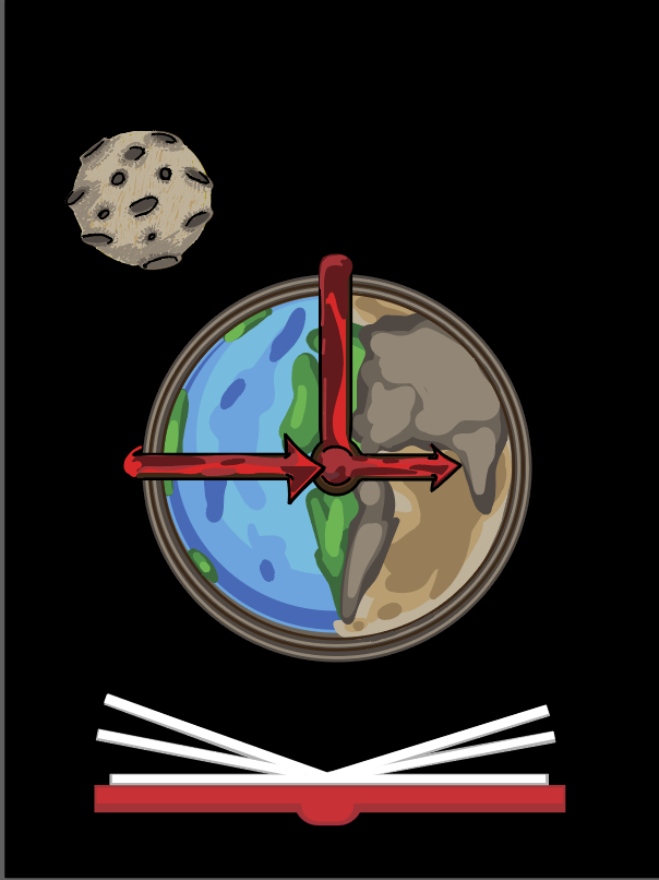
Now with the added black background, I decided to create a moon for the earth. This was constructed with many shades of brown circle shapes with added light highlights to create the right texture. Once the colours were done, I increased the paint thickness of black and made the craters look more distinctive. The book was made with tones of red for the cover with the pages shrunk slightly in white and grey.
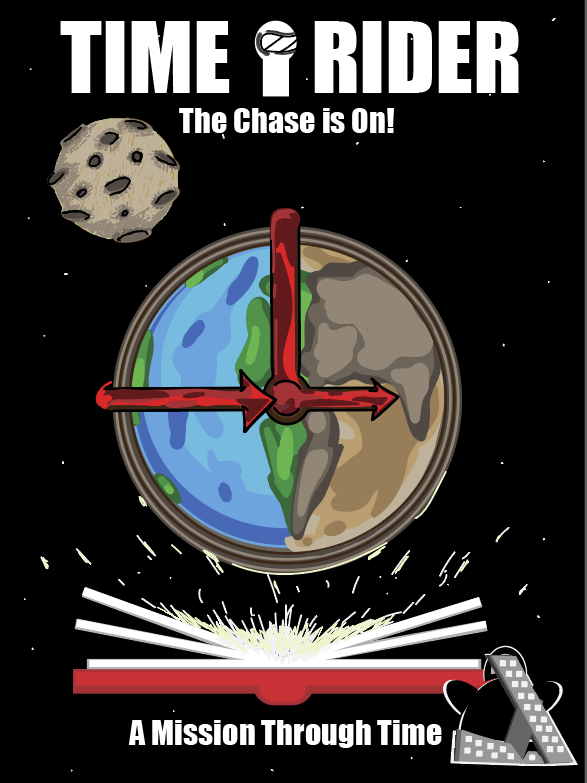
When the main imagery was done I moved onto the typography and logo. The appearance of the last logo looked too rough and draft so I had to redevelop it in illustrator, making it look more clean and presentable. At first, I had a problem with the clarity of the logo, the black blended in too much with the background so I thought I would add a white highlight around it to make it stand out.
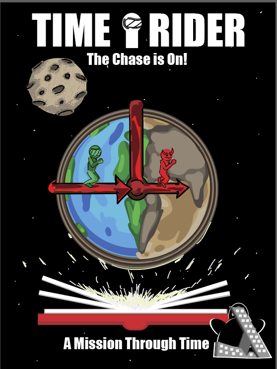
For the typography, I used the font “Impact.” I decided to use this because of the boldness it gave the words, the words seem to have a very tight kerning space between each letter making it easier to follow while appearing more direct.