
In this post, I shall build upon the campaign’s identity, producing ideas and design work that can be used on my posters and display pieces as branding to promote the campaign’s image.
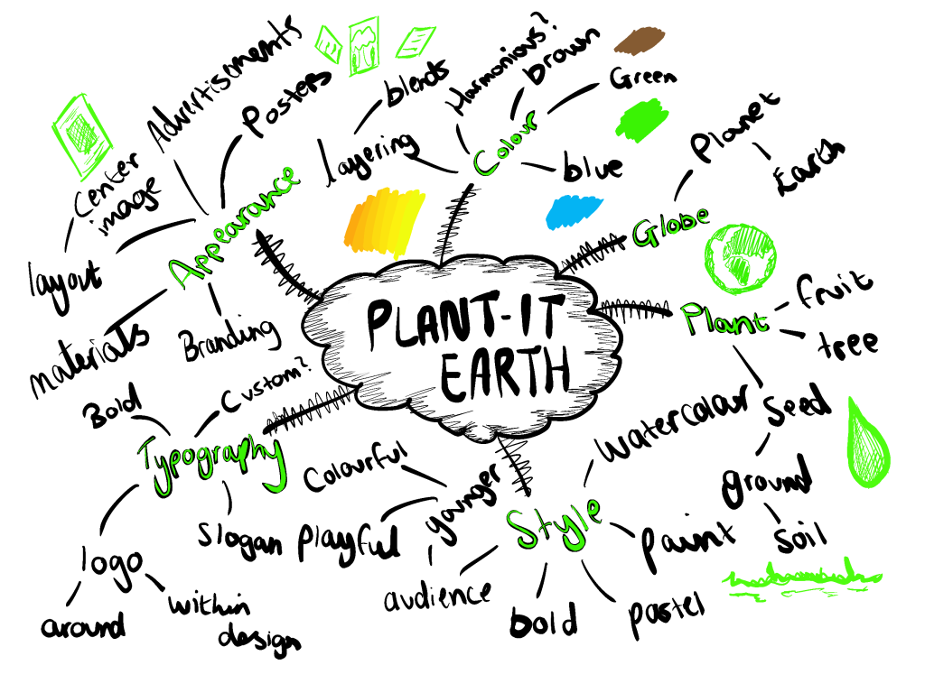
First I must decide what the name of the campaign will be, here below I will list these ideas based on a combination of influences to do with deforestation:
-Green Forest
-GoGreen
-Green Tree
-Plant-it Earth
-Treeco
-Forest Nation
In my opinion, I like the name “Plant-it Earth” I think out of the list this one will be the most effective when producing imagery which relates to the campaign. I could produce some sort of illustrated world visual that has something to tie the whole globe together, involving the different continents to show that Deforestation is not only a single cause in one area it globally affects all.
Concept Design Sketches –
To start the design process, I decided to produce a few sketches to warm up with, all of these visuals are ideas that I could potentially use for my logo or other elements for my work.
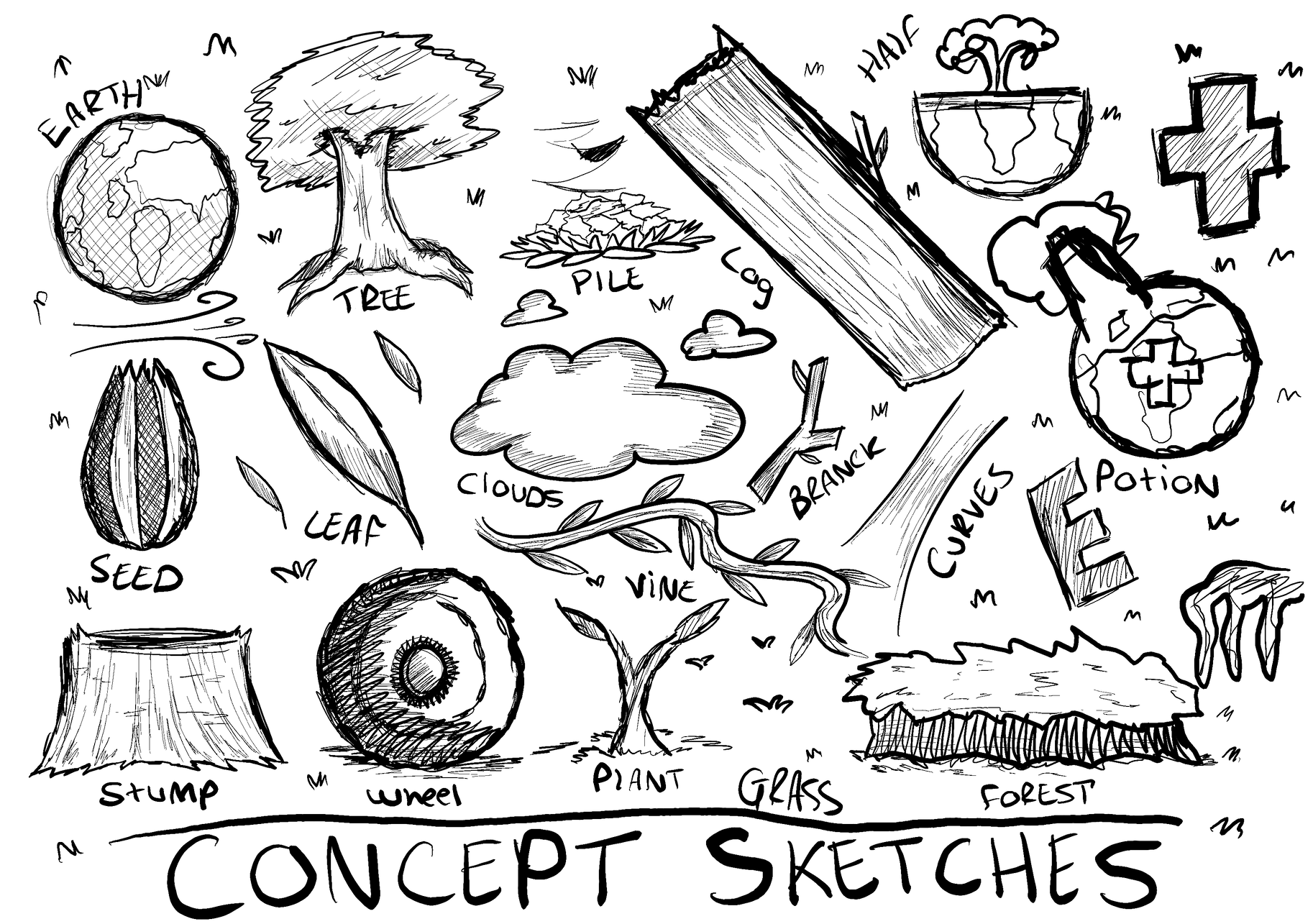
I have found doing this warm-up quite useful when thinking of different ways to tackle this logo, it was a creative way to lay out all of my thoughts onto one page. Straight away after doing this, I began to produce the imagery shown below:
These designs presented shall be picked and explored into mainly used as a base for the real thing, out of them all only 2 of them seem to appeal to me, the standard first planet and the last one, they both have the potential to be moulded further into a strong outcome.
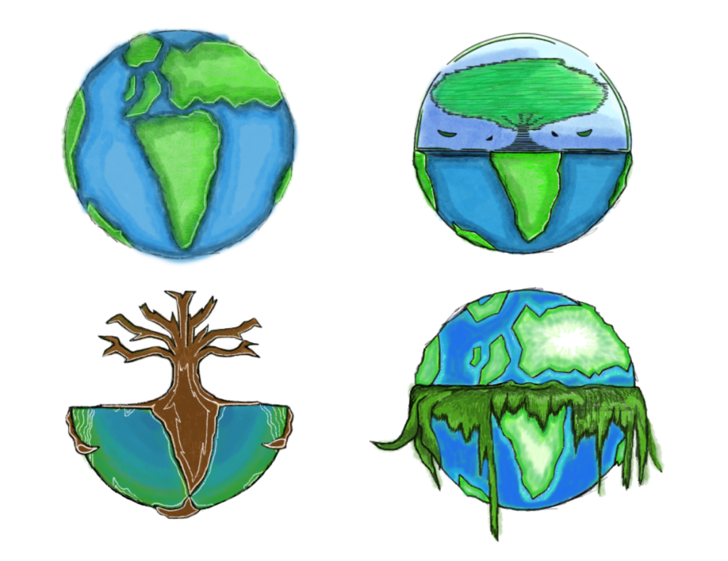
Logo Experiment 1 –
This logo design didn’t turn out as I would have liked it to be, I am not a fan of how crowded the design is and the position of each imagery. I took inspiration mainly from the potion bottle illustration from the concept sketches and combined it with the tree to make it the whole shape. There are elements of this piece that I do like however, I like the way textures have been applied to the visuals using different mediums.
Logo Experiment 2 –
For the second experiment, I wanted to expand upon the first original basic earth design and use the concept sketches to influence the result.
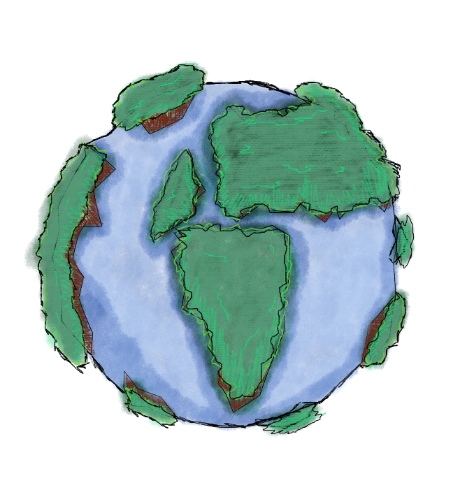
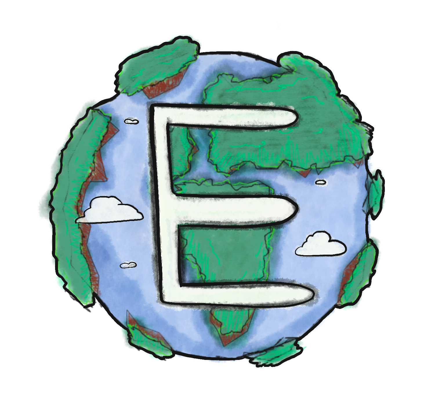
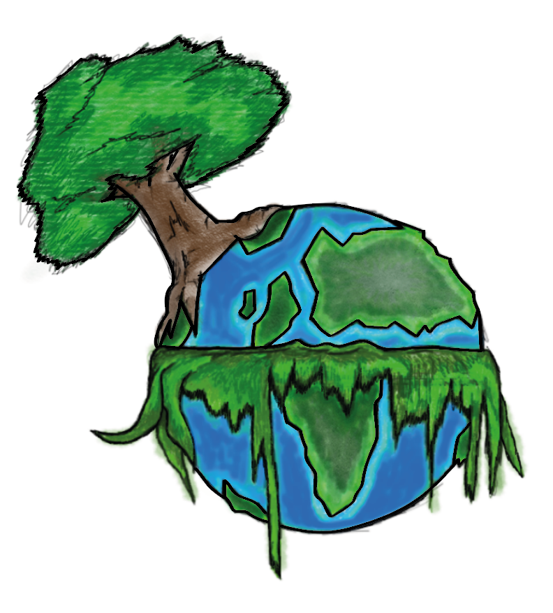
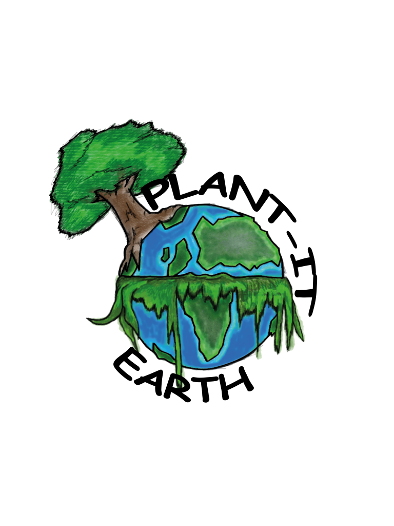
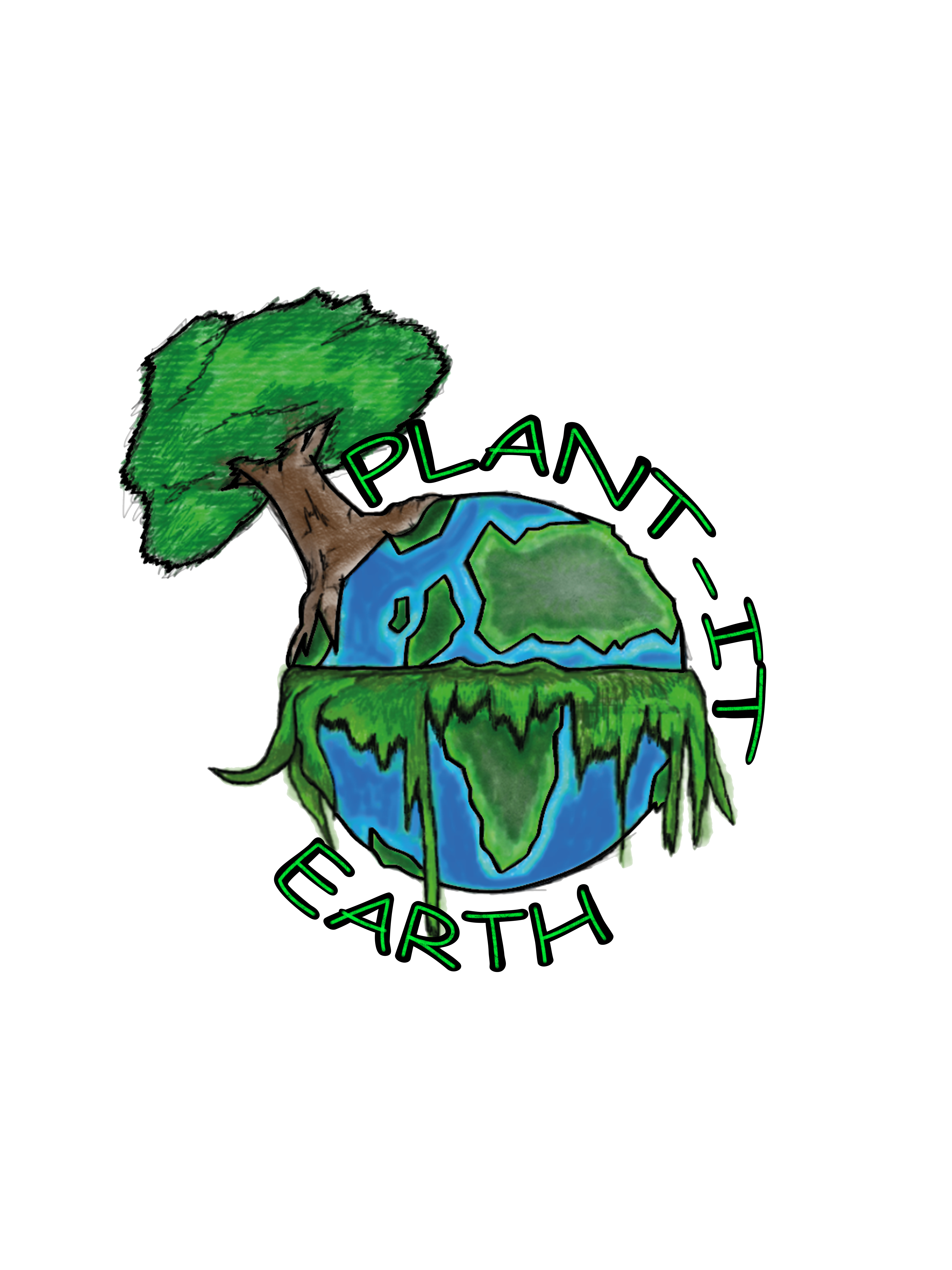
The imagery for this logo was mainly influenced by the combination of the forest visual and the clouds from the sketches, I had an idea to tie them together with the Earth by making them in the shapes of continents. These continents will help to show that there’s more than just one area of the world that needs aiding, there are forests and trees all over that suffer from Deforestation. The clouds within the design will mainly act as decoration appearing in white upon the logo to show how clean the air/sky is when populated by an earth full of life. To stray away from the logo just being a visual, I decided to add the letter ‘E’ in the centre of the image, this was mainly to emphasise the word ‘Earth’, and how the letter can also be for everyone.
Typography –
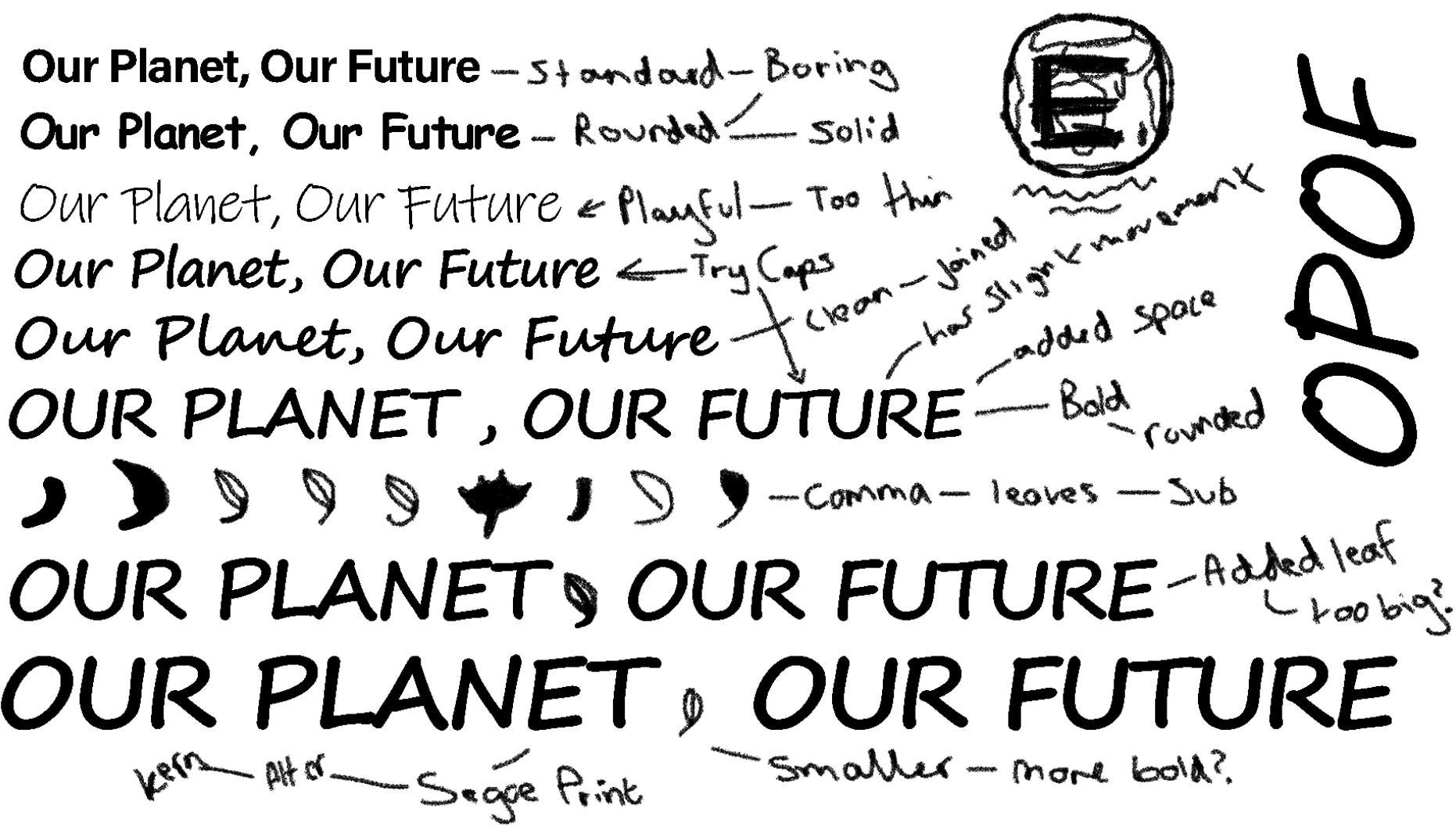
Now that I am happy with the structure of the logo, I want to add a small slogan to accompany it that summarizes everything as a whole in a few words. Here below are a few ideas listed:
-Save the trees, Save the Planet!
-Our Future, Our Responsibility.
-Plant a Tree, Plant the Future.
-Our Planet, Our Future.
-Say No to Deforestation: Keep Our Forests Standing Tall!
-Be the Seed of our Future.
-Stop the Destruction, Not Cause it.
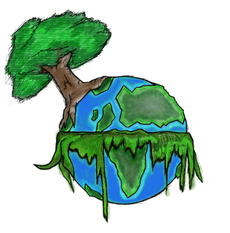
Result –
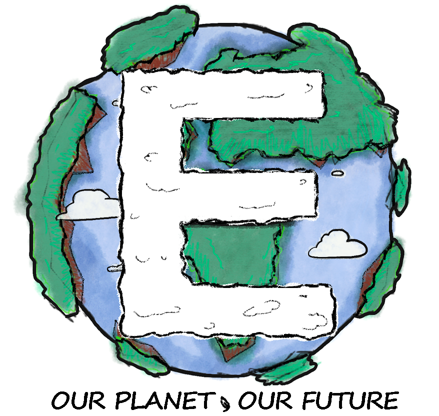
This is the final design for the logo, I have made a few tweaks to it since the previous imagery making it a lot bolder and clear while still keeping an illustrative structure. The letter ‘E’ in the centre has also been defined more, I shaped it slightly making it take the form of a white cloud in the sky to accompany the other small ones, the purpose of the cloud imagery is to show how pure and clean the air could be with the trees in the background providing the world with oxygen. Like the last design, I have kept the concept and meaning behind the trees within the logo making them in the form of continents, this is to show that the issue isn’t just focused in one area but around the world, together we can help plant more trees to make the planet greener and eco friendly. I personally like the way this has turned out, its visual style is playful and aimed towards the younger audience appropriately, since its shape is so compact also it should work great at different scales on the materials that I am looking to produce.
In the next post, I will be designing the 3 posters for the campaign these will involve the design work that I have created so far, using some of the character designs to try and spread the message across.