In this post, I shall be making a start on the poster designs for the campaign. These posters shall be illustrated and aimed towards the younger audience showing them the effects of Deforestation and hopefully educating them also on the cause to raise awareness.
Poster Design 1:
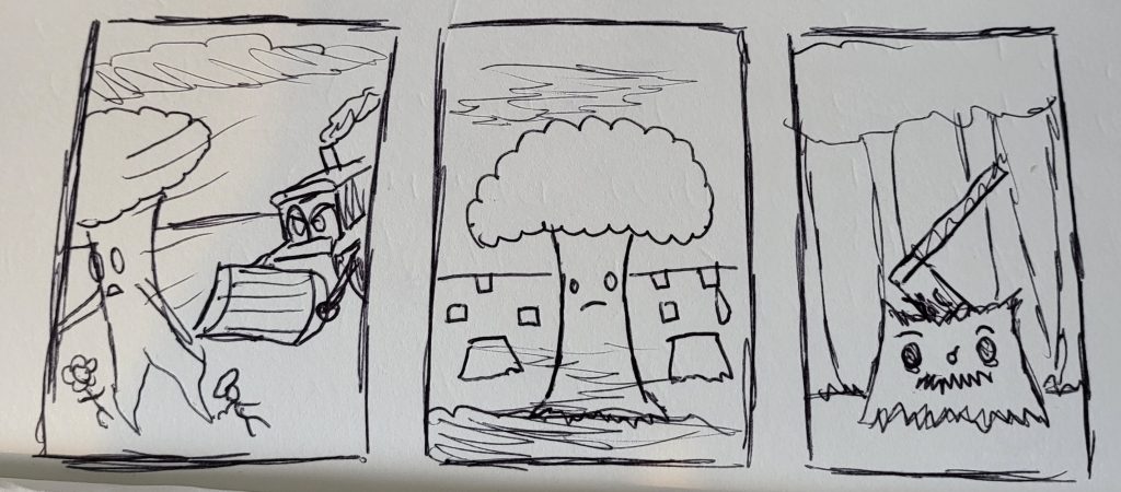
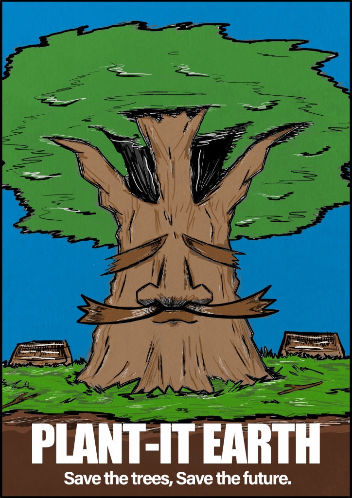
Here is my beginning design work for the first poster of the three, since I had a rough outline and idea for this specific image the progress was swift in development.
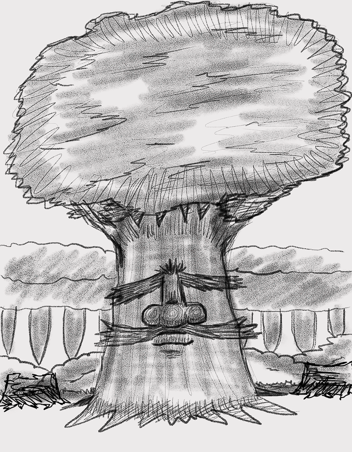
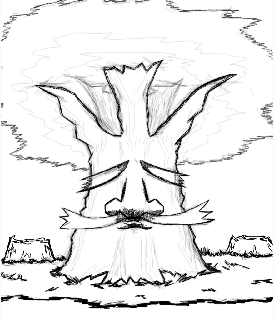
I experimented quite a bit with the change of what’s included within this poster, trying different background environments and imagery in places. I found having too much scenery becomes crowded, making the visual a mess, and clouding the image’s main purpose of directing the message to the viewer. The message that I want to show to the viewer in this design is that Deforestation is stripping away tree by tree, which could lead to the extinction of the life presented. Having only one tree left makes them endangered, the tree in the poster has had its group taken away from it making it lonely and isolated. I want to be able to have the younger audience realise that it’s not fair and feel an emotional connection to it.
Timelapse –
Poster Design 2:
Moving on to the second design, for this poster I want to produce a design that ties both nature and construction together to unite in a positive way.
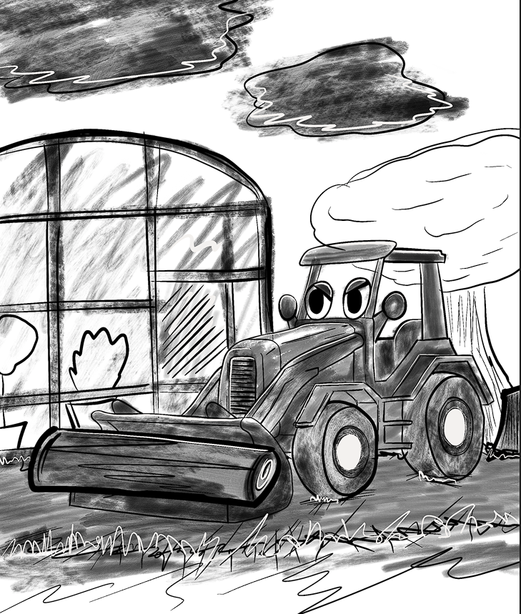
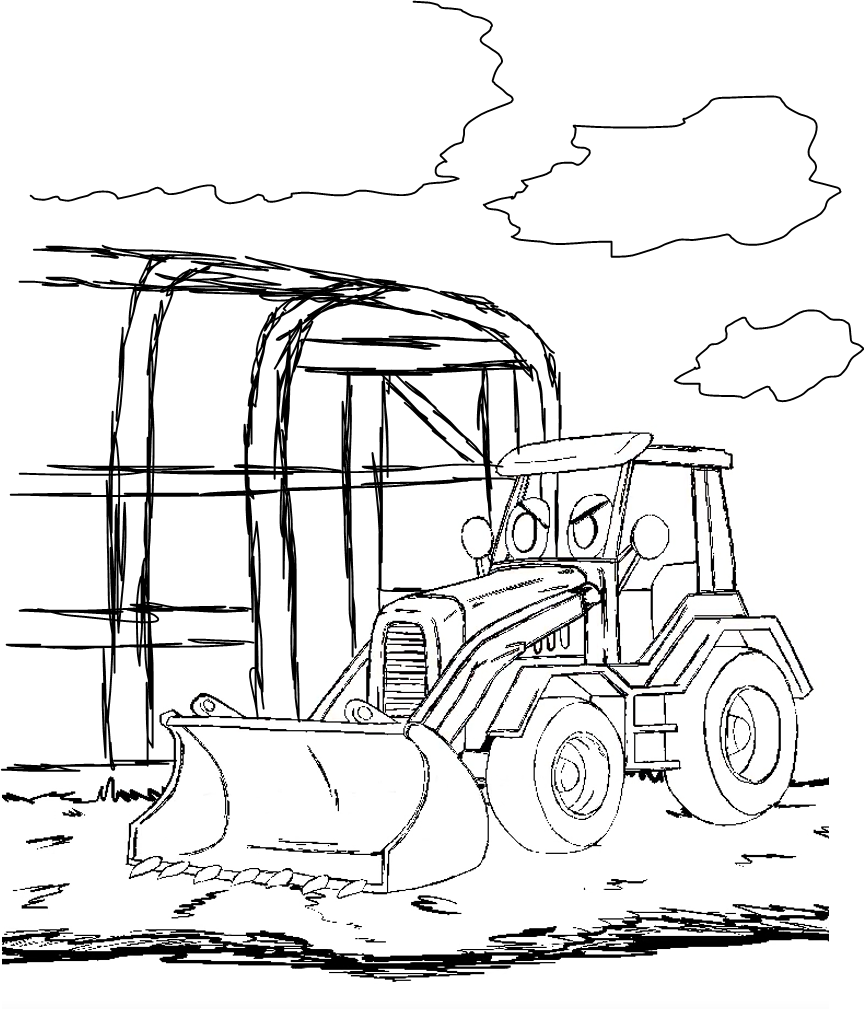
This poster includes the character Bully the Bulldozer carrying a few logs away with a greenhouse sitting in the background. Showing both deconstruction and nature within one image I want to explain that there are other ways that each other can work together, to build a world we can all live in. Greenhouses provide life within a confined space built and grown by individuals, this is a great example of how both can work together without deconstructing which harms nature, it aids it instead and provides support. The poster’s main message is to not destroy nature but to help support it, that there are other ways to make a difference than creating damage.
Timelapse –
Poster Design 3:
For the final design, I wanted to take a more visual approach and illustrate a small story with the image to show the cause.
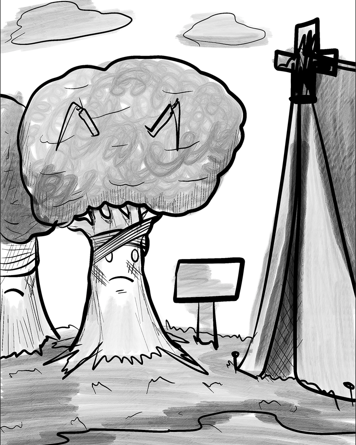
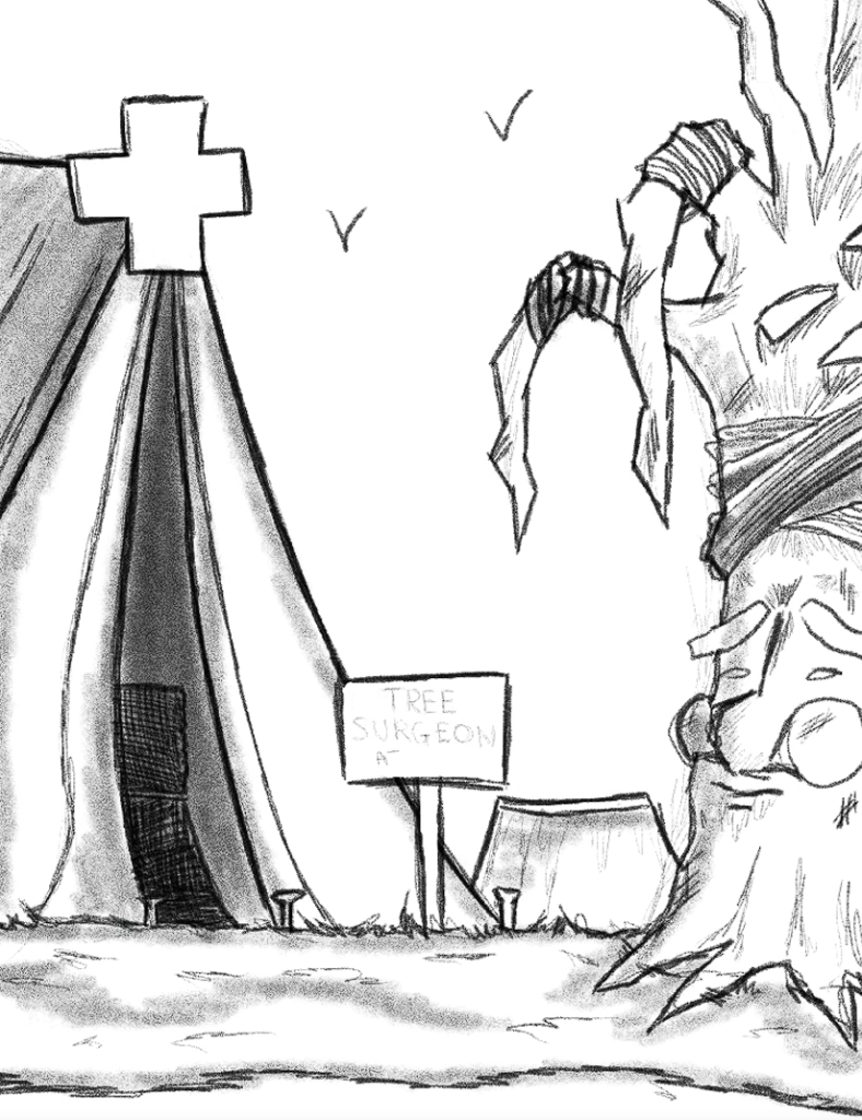
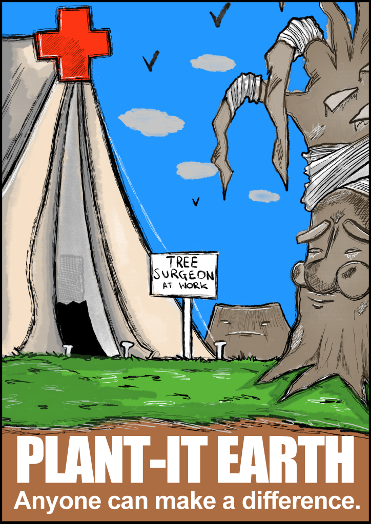
My idea for this poster is to make a first aid tent within a scene and have trees lined up to it for medical attention. This visual will be a way to show that there’s always a way to provide help, even if it’s just applying a bandage to the tree, every bit of support matters and will benefit in some form. They are professionals that deal with these issues but with more than one person we can create a massive impact on the environment, preventing Deforestation all around the world. The sign stating,’ Tree Surgeon at Work’ is mainly to show that there are people that do help out, the only issue that I have with this sign is that there are 2 different types of tree surgeons one that helps and the other that cuts down trees, to avoid confusion I added the first aid plus sign above the tent to hopefully make the differentiation a lot more clear.
Timelapse –
Results:
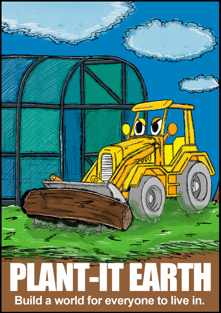
Here are the final results presented together side by side, I really enjoyed working on all three of these designs, they challenged me to think more deeply about the concept of imagery and how positioning can be important to receive the correct message. My favourite out of the three has to be the Bulldozer design, its graphical boldness has been spread throughout all of the designs but looks most effective in this one, the heavy line work greatly complements the yellows on the body of the bulldozer making it the hero image of the whole poster. The poster itself shows the deconstruction of a tree carried by the bulldozer with a greenhouse in the background, I did this mainly to state that there are other ways to approach things, we all can live together without causing harm to the world. If I was to take these designs further, I would consider mapping out the pages more efficiently I think, I tried to make them all in line with one another so they could create a slight connection to bring them closer together but I feel like the illusions not strong enough because of the difference of colour palette and scale.
In the next post, I will focus on building the display board for my project. This board will contain visuals that create an interactive element for the younger audience to get involved with.
