Here is a rough layout of my design idea within sketchbook and note form. By creating it in a mind map, I was able to branch off and explain certain areas of the poster with its purpose so it would be easier for me when I come to illustrate.
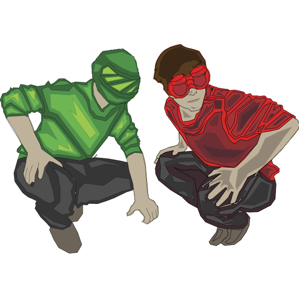
My ideas here have been influenced by both of my experiments with photography and Adobe illustrator. I would like to combine the illustrated elements from the Adobe piece with the photography so I can gain accurate shapes and forms.
The two characters will be in the same position as in the photography image but re-illustrated like this to match their surroundings. To create these I used the pen tool on illustrator, starting from tracing around my photograph in a dark colour. By using a dark colour I can layer lighter shades above the shape to build depth in the character. I decided to not make them full emerged with the chosen colour because I found it would be less clear to see the characters and without a heavy border it can get lost into the background.
Draft:
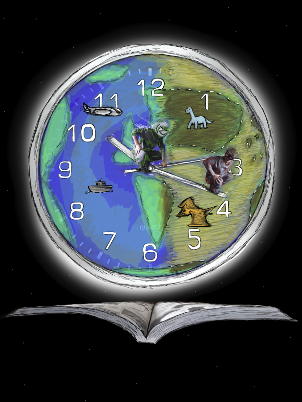
This is a very roughly illustrated draft of what the poster would look like with the layout.
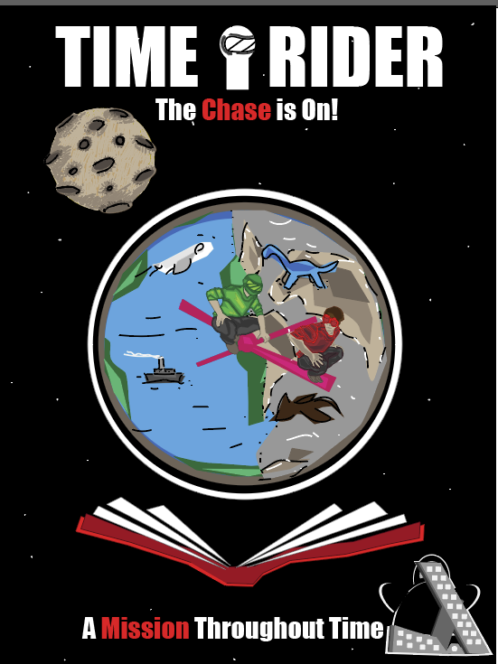
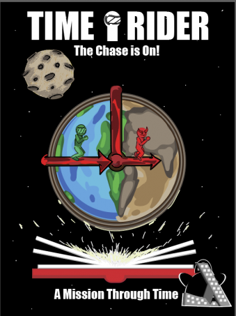
This is a poster in promotion of one of my time travelling comics, about two people travelling across time, one trying to catch the other. In this poster you can see a world shaped clock in the centre of the page, one half representing the present and the other being the past. As the handles turning the worlds slowing being converted into an old-time period, being the Jurassic in this case. In the more refined poster I will be adding a soft glow around the world and the book, this is so it looks like the books just brought the story to life.