This weeks task was to remove the name from the logotype and produce a graphic that explores the subject matter that I have chosen, discussing the concepts of colour along the way.
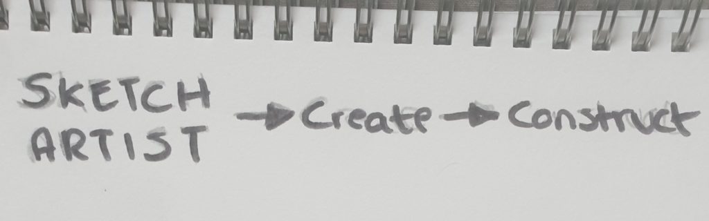
First I began to create a list of words to do with my subject and tried to narrow it down to one keyword.
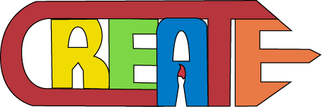
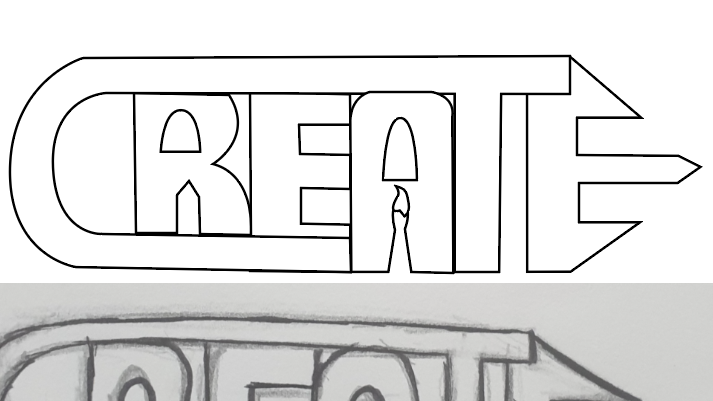
The word “Create” really seemed to spark my interest when listing the other words because I could make my subject relating to creative construction of visual graphics. However I still wanted similar aspects from my last logo because it had an important connection to me being an artist so I added some more shapes to the imagery, expressing the use of painting and drawing within the logo.
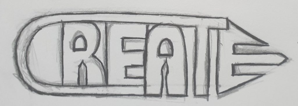
Once the sketch was complete, I scanned it into illustrator. Using the pen and pathfinder tools I was able to create the solid and clean structure of the logo with ease. The only struggle I found for this section was getting the right measurements and scale for the letters, each area of the logo seemed to have a off balanced appearance so I gathered the anchor points making them seem accurate as possible.
To explore with colour, I carried on using the PANTONE pallets. This colour scheme below seems pretty playful and fun I think, the mixtures of the solid colours remind me of when I use to do arts and crafts in school. Using all sorts of different coloured materials to create something. I personally like the way paint brush between the “A” has been set out, the colour at the tip of the brush really seems to stand out against the blue.


This one underneath was really just an experimentation of how adding shades of the same colour could effect the logo, I found by doing this it creates a harmonious balance within the type.
Result: