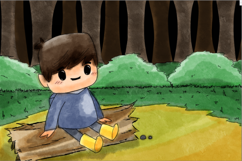
In this post, I shall be sketching both by hand and digitally to create illustrations and visuals for the story. To begin with, I opened up my sketchbook and started off by drafting visuals for Noah.
Noah:
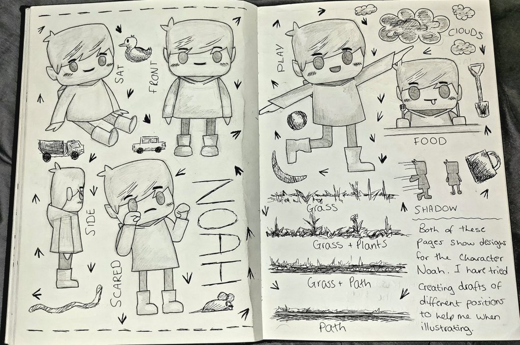
From my sketchbook, here are a variety of character sketches of the character Noah. I have tried to develop as many of these drafts with different expressions and possess so I can convert then digitally and add them straight to the story.
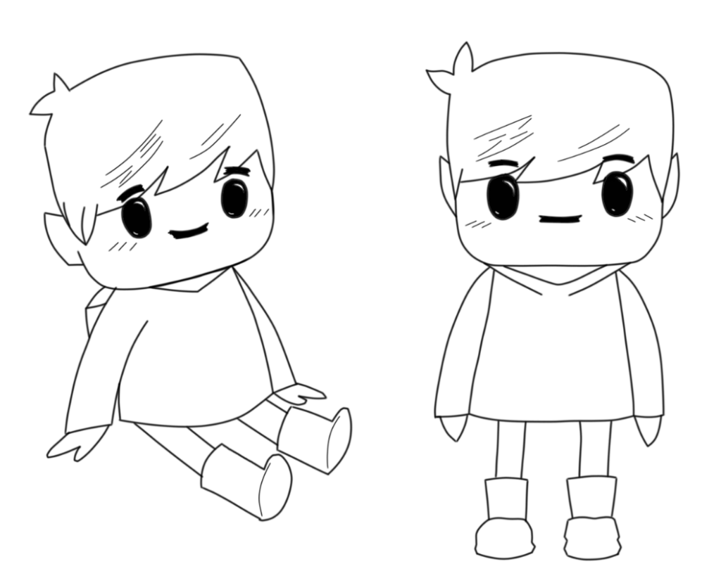
After producing sketches of the character, I scanned the work onto my computer and started to generate a few digital outcomes using the software Sketchbook Pro.
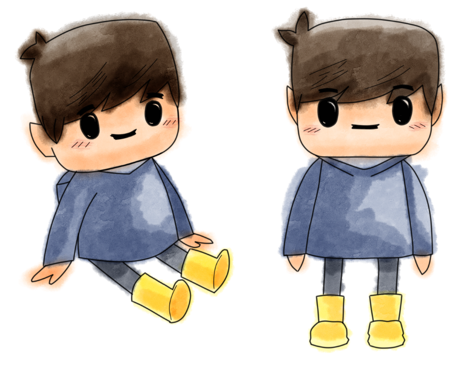
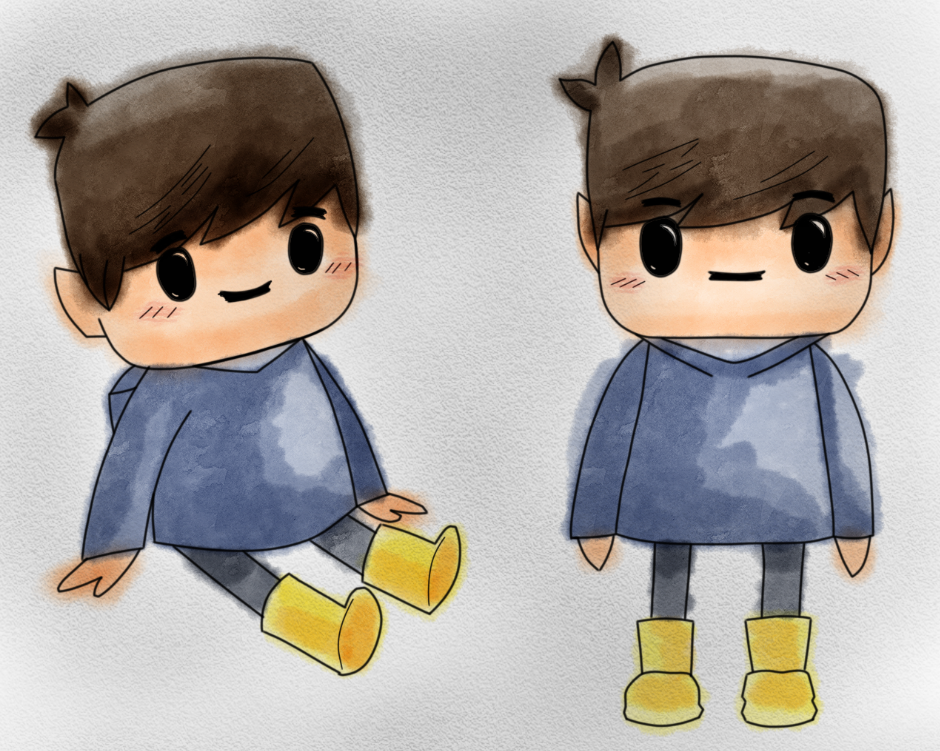
Using the pen tool, I lowered the opacity of the original sketches and created an outline of the character. With this outline, I could freely experiment with colours and apply them easily with a blank canvas.The coloured brushes that I decided to use was water colour, I really like the way the colours come to life blending on top of one another. Colours can be layered, starting off light, building up tones in contrast.Here I have added a low opacity of black charcoal to the image to create a sketchbook background appearance. I decided to stick with the roughness of the watercolour marks, the way it’s not kept within the lines, makes it seem more child-like.
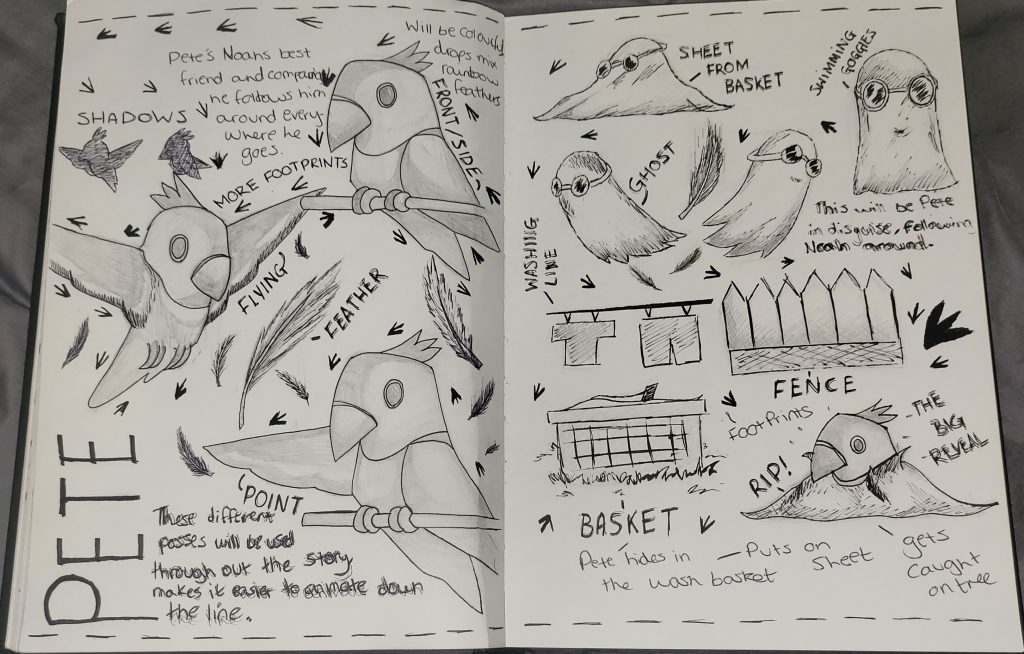
Pete:
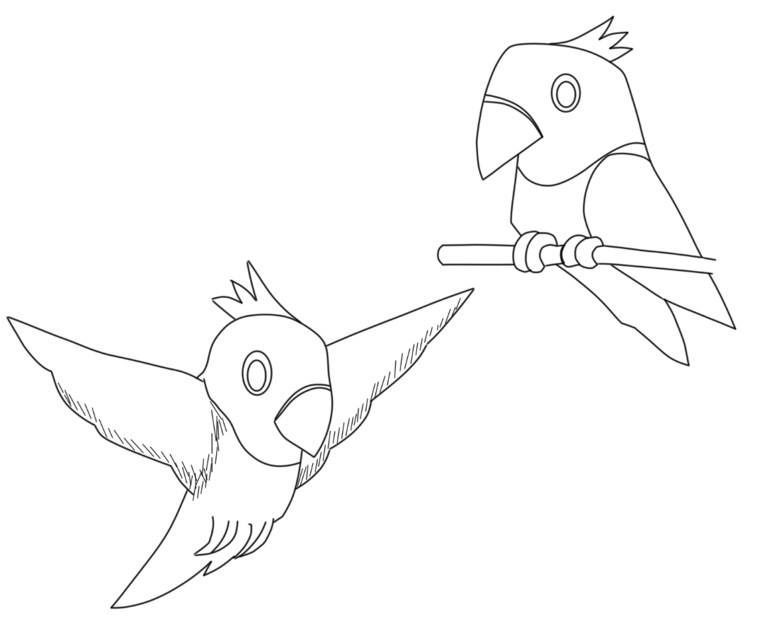
Here’s the next page of the sketchbook, it shows the character Pete in a range of position with added imagery. Like Noah, I will convert these drafts digitally so I can add then to scenes more conveniently as assets.
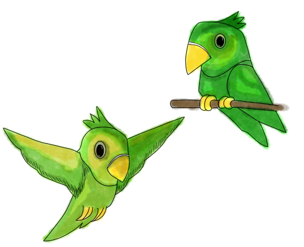
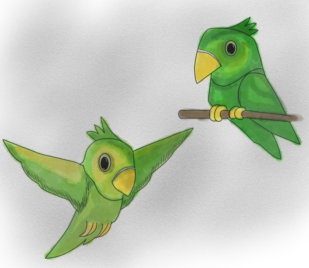
Using the same method as before, I scanned the images onto Sketchbook Pro and began to work. Using water colour on Pete seemed more difficult than with Noah as I struggled to create the same blends of colour within each image leaving much darker tones in areas. To overcome this, I added a mixture of yellows and browns to the green overlapping areas of highlights and darks that are overpowering.
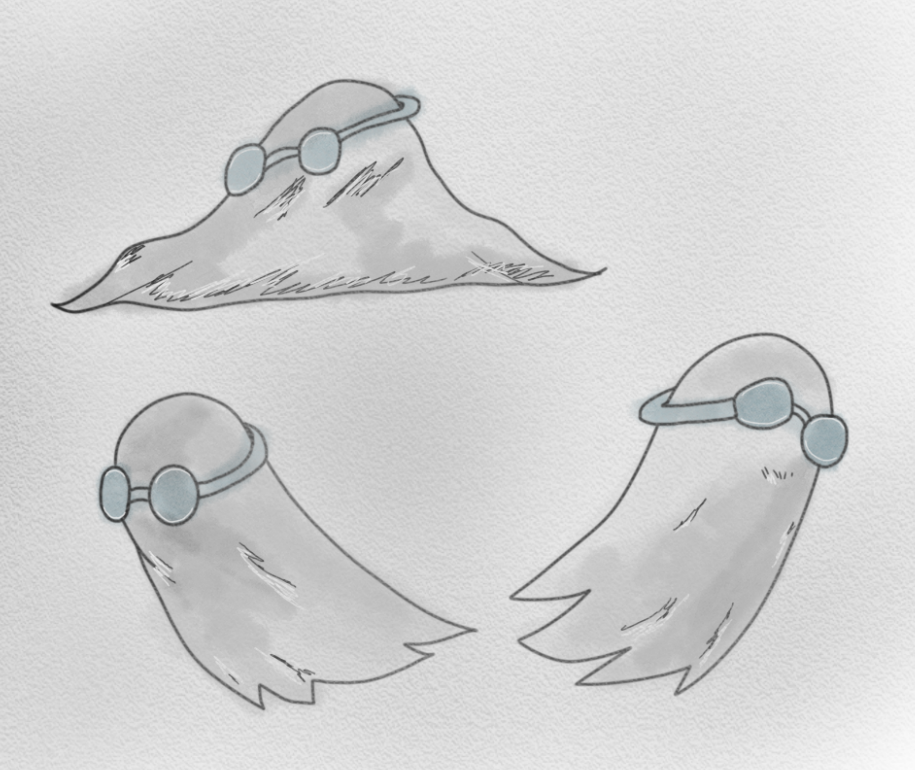
Ghost:
This is going to be the imagery that I’ll be using for the ghost’s appearance in the story, it’s a rather simple white sheet design with a pair of swimming goggles on the head. I decided to add these goggles to the design because when sketching the storyboard, I felt like there was something missing to the figure, they not only add a detail for the eyes, but it helps when judging the characters direction when drawing.
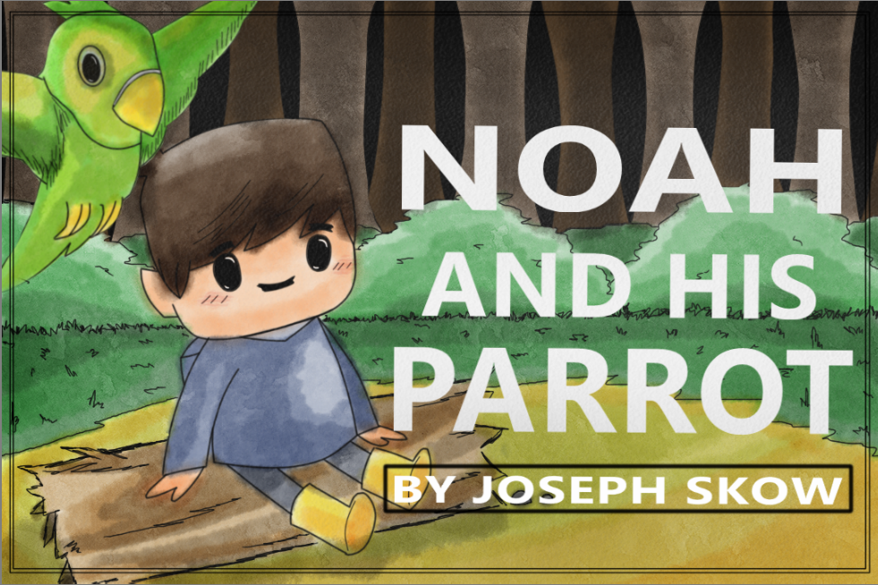
Front Cover:
To create the front cover, I started off by taking my Noah character asset and layered it onto a blank background. On this canvas I used one of my storyboards as reference and sketched out with the pen tool to create a basic forest outline. This background will also be used throughout some of the scenes of the story, especially when Noah gets lost and being chased. To apply colour, I used the water colour brush to layer over areas building up tones greatly with contrasts.
This was the result when I finished adding colour to the background, I have let the colours bleed and merge overlapping each other to express different colour blend, this in my opinion also gives the illustration style more of a playful approach.
To finish off the front cover, I made sure to add Pete in the scene positioning him in a place where he’s visible, not crowding the image. By positioning Pete in the top left corner, I made room for the main title and Author section, the text used is a standard type face with a strong white bold edge upon it to make it stand out greater than the background. After the text was added, I layered over the whole cover with a low opacity of black using the charcoal tool, this creates a paged book appearance in my opinion, giving more rough/harder visuals. Finally, to top things off I added a thin double border to the cover.
In the next post, I shall discuss about assets and how they will be used within the story.