
This weeks task was to analyse a piece of visual design within our subject area, I chose this above (The Art Of The Journey) a piece of concept art by Mathew Nava.

I have chosen to look into this because of the way everything is structured, going from bottom to top showing the development process as sketches leading into the end result. In relation to my subject, the creative construction of visual graphics, I see a close connect to this piece of concept art. The line work at the beginning of it seems to be very loosely made with all sorts of shapes layering each other similar to my subject, both relate in a way of the construction of the visuals.

Sketches have been refined to a more smooth and solid appearance. Each character presented is carrying their own tones of colour, ranging from soft reds to dark browns, this creates the correct depth needed to bring it to life. I do personally like the purpose of the characters made here, the designer has created these as mysterious beings with no gender identity. He has done this to suit all audiences preferences.
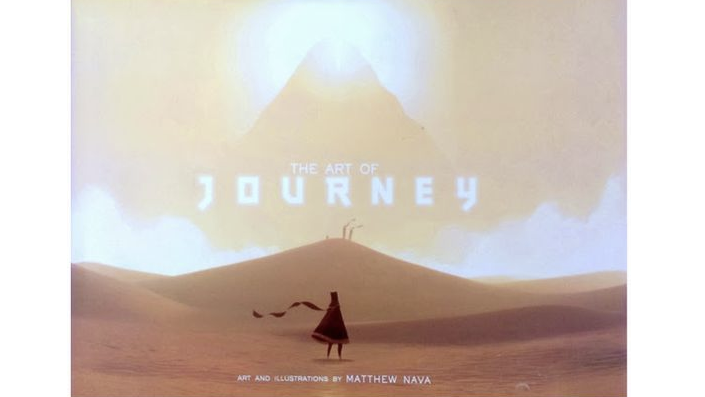
Here you see the character straight away centralised at the bottom of the image, they are looking up to this strange figure appearing in the clouds. I believe the artist has done this to fuel the viewers imagination in a sense, making them question what is lurking in the mist. The scenery seems to be a vast desert area surrounding the character with sand looking clouds covering the sky. Text has been positioned right in the centre of the image in white with the word ,”journey” blurred slightly, giving the appearance of light shining through the dusty clouds.
The target audience for this would be around 13+ I would say because its mainly trying tell the concept of the story by visuals, anyone younger may not understand what’s happening within the design.